Get ASSURED COMPLIMENTARY shipping on order starting from Rs 3000 only

Choosing the Right Color Scheme for Home Decor
The secret is hidden in the colors around you
9/18/20243 min read


Have you ever entered a room and felt instantly peaceful, invigorated, or even slightly uncomfortable without knowing why? The secret is hidden in the colors around you. While many homeowners focus on furniture and layouts, it is the color scheme that softly orchestrates the overall emotional experience of your living space.. 🎨
Whether you're looking at paint swatches and feeling overwhelmed or planning a whole home makeover, selecting the appropriate colors may be a stressful endeavor. From bright statement walls to subtle neutral palettes, the possibilities are limitless - as are the opportunity for blunders. But do not worry! We're here to walk you through the intriguing realm of color psychology and practical interior design ideas, allowing you to construct your ideal place. Let's look at how to choose a color scheme that not only looks great but also expresses your personality and enriches the environment in your home.. 🏠✨
Understanding Color Psychology
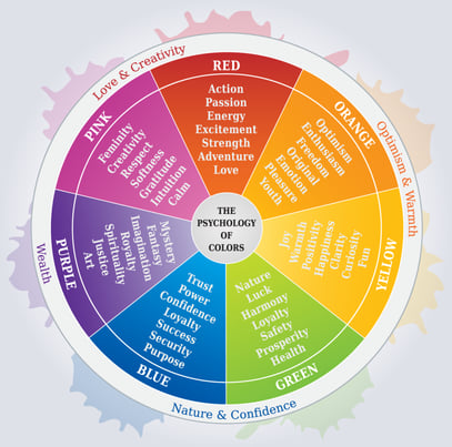
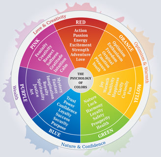
Impact of Colors on Mood and Behavior :
The use of color in interior design can make or break the vibe of a space. Every color in interior design plays a unique role, from generating emotions to setting the tone of the space:
White: White is commonly linked with purity, simplicity, and cleanliness. It generates a sense of tranquility and harmony in a room, making it appear larger and brighter.
White walls are a common choice in modern interior design, and they may be combined with a variety of accent colors to create a particular mood or environment.Red: Red is a vibrant color that may instill a sense of passion and energy in a room. It is commonly used as an accent color in interior design to bring warmth and depth to a room.
Red works especially well in people's meeting places, such as living or dining rooms. However, too much red can be overwhelming, therefore it should be balanced with other hues and used sparingly.Blue: A space can feel more serene when blue is used because it is a peaceful and soothing color. Darker blue hues can produce a cozier and more intimate ambiance, while lighter blues might give the impression that a room is bigger and more open.
Because of its relaxing properties, blue is frequently utilized in restrooms and bedrooms. Additionally, it's a popular color for interior design that has a beach or seaside theme.Green: Green is an adaptable color that may give a space a feeling of harmony and balance. It can produce a serene and revitalizing mood and is frequently connected to nature.
Darker green tints can produce a cozy and private ambiance in kitchens and dining areas, while lighter greens are ideal for living rooms and bedrooms. Another popular color for sustainable or eco-friendly home design is green.
Yellow: A space can feel happier and more positive when yellow is used because it is a bright and cheery color. It's frequently utilized to create a warm and inviting ambiance in dining rooms and kitchens.
Because of its fun and whimsical qualities, yellow is especially well-known for kids' rooms and play areas. But too much yellow can be overpowering, so it's important to use it sparingly and balance it with other colors.Purple: A space can be made to seem more sophisticated and elegant by using the royal and opulent color purple. It's frequently utilized to create a soothing and peaceful atmosphere in restrooms and bedrooms.
Darker purple hues, like plum, can evoke a more dramatic and daring ambiance, while lighter purples, like lavender, can evoke a romantic and feminine feeling. Another popular color for eclectic or boho interior design is purple.Orange: Warm and energizing, orange infuses a space with passion and enthusiasm. It's frequently utilized to create a warm and vibrant environment in living and family rooms.
Because it encourages creativity and productivity, orange is also a popular color for home offices and workspaces. But too much orange can be overpowering, so it's important to use it judiciously and balance it with other colors.Black: Black is a powerful and dramatic shade that can instill a sense of grandeur and elegance in any space. It is frequently utilized in modern and minimalist interior design to create a sophisticated and fashionable ambiance.
Black can also be utilized as an accent color in a room to add contrast and depth. However, too much black may make a room feel dark and oppressive, so balance it with lighter colors and use it sparingly.Grey: Grey is a neutral and versatile shade that may add balance and sophistication to a place. It is frequently used as a base hue in interior design, and it may be combined with a variety of accent colors to create a particular mood or environment.
Lighter shades of grey can generate a tranquil and peaceful atmosphere, while darker tints can create a more dramatic and moodier environment.

© 2024. All rights reserved.
POLICIES
GET IN TOUCH
HELP
COMPANY
My Orders
My Account
Returns
Milestones
Sustainability
Environment
Certifications
Toll Free
Youtube
Careers
PAY USING
100% Secured Payment
Discover Premium Home Furnishings That Fit Your Style and Budget & Transform Your Home
HOME EMOPORIO.SHOP
Follow Us
Credits